
Brand kit
Everything the brand owns.
Colours, type, marks, mascots and motion, with the files behind them. If a surface needs an asset that is not on this page, the asset does not exist yet.
Palette
Four fixed brand colours. Everything else on the site is a semantic token derived from them, which is why a surface never hardcodes a hex: light and dark are the same code.
ink#192837
Body text in light, surfaces in dark. The brand's weight.
accent#7342e2
One job: the action, and the neutral state of the owl's eyes.
cream#f2f2ee
The page in light mode, the mark on dark chrome.
sand#cfc8c5
Muted structure: sheets, beaks, talons.
When a protocol or a stablecoin is named next to our mark, it wears its own colour rather than ours. Borrowing the accent for someone else's standard implies we own it.
ERC-8004#7342E2
x402 / USDC#2775CA
MCP#1AAB7A
USDT#26A17B
PYUSD#0E2A8C
Type scale
Three steps, fluid between breakpoints, all in the brand heading face. The rule: one display per page, sections open with section, groups with sub. Numbers in running UI are mono and tabular.
display
Trust, before you pay.
section
Every payment goes through the check first.
sub
Bounded authority, human on the loop.
Logo
One mark, three forms: the mark alone, the horizontal lockup, and the stacked lockup with the wordmark underneath. The full-colour ribbon monogram is the primary logo; every file here is rendered from that one raster and the site's own heading face, never redrawn by hand.
One-colour silhouettes, for chrome that cannot carry the gradient: the brand palette first, then every live chain in its own colour for co-branded placements. Each tint ships all three forms; the silhouette is the mark's own alpha channel, flat-filled.
ink#192837
accent#7342e2
cream#f2f2ee

Arc Mainnet#2775CA
Arc#2775CA
Stellar#7D00FF
Algorand#8C929C
Base#0052FF
Robinhood Chain#0F9D30
Arbitrum#28A0F0
X Layer#8A8F98
Celo#FCFF52
Verdict marks
The logo carries the company; the owl mark carries a decision. The owl's eyes take the verdict colour, the exact values the explorer's risk pill uses, so a mark and a pill can never disagree on screen. Neutral accent is for surfaces that are not reporting an outcome.
Neutral
Allow
Warn
Deny
Mascots
Three owls, each bound to a state rather than a mood. The GLB is the source, the PNG is a poster rendered through the same camera the live viewer uses, and the two frame identically by construction. Anything that cannot be mapped to a state does not get a variant.



Perched on the cardGLB
For payment and wallet surfaces.

PresentingGLB
For introductions: points at whatever sits beside it.
GLB only
T-pose (source)GLB
Rigging source. Meshy pose estimation rejects the proportions, kept for future attempts.
Full design review, silhouette tests included, lives on /mascot.
Section art
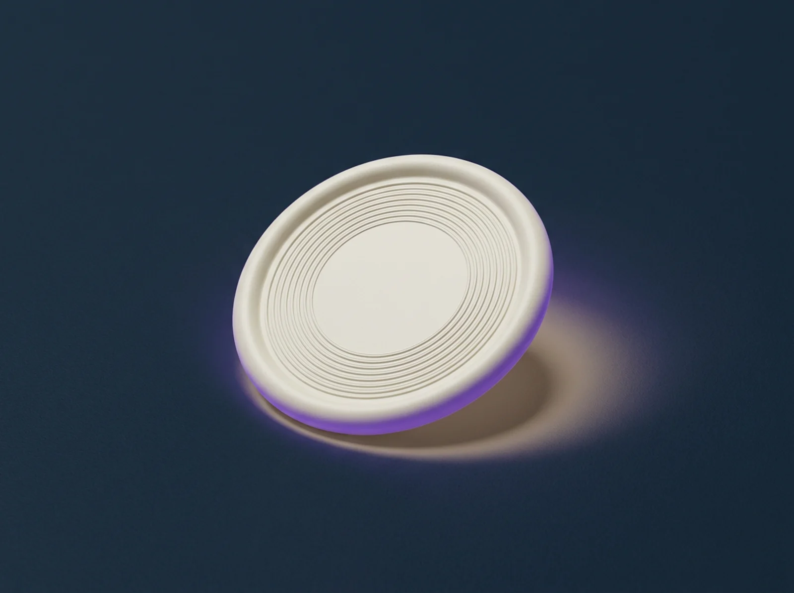
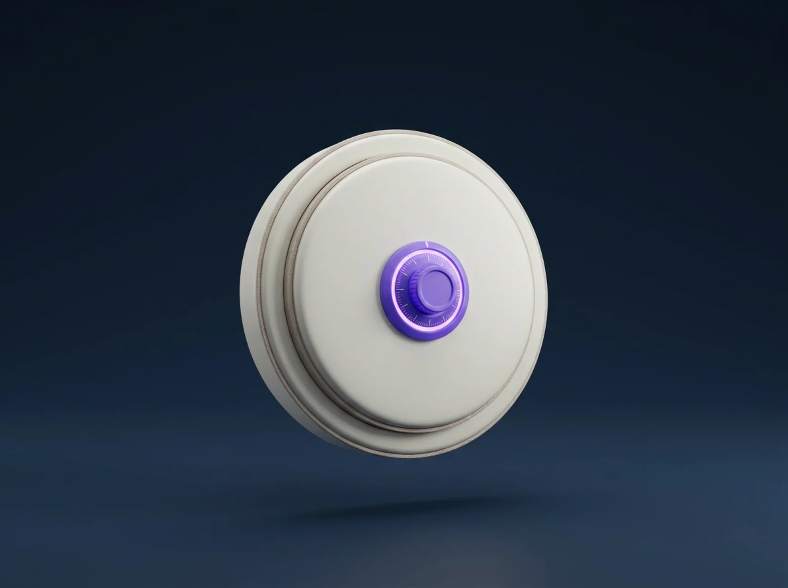
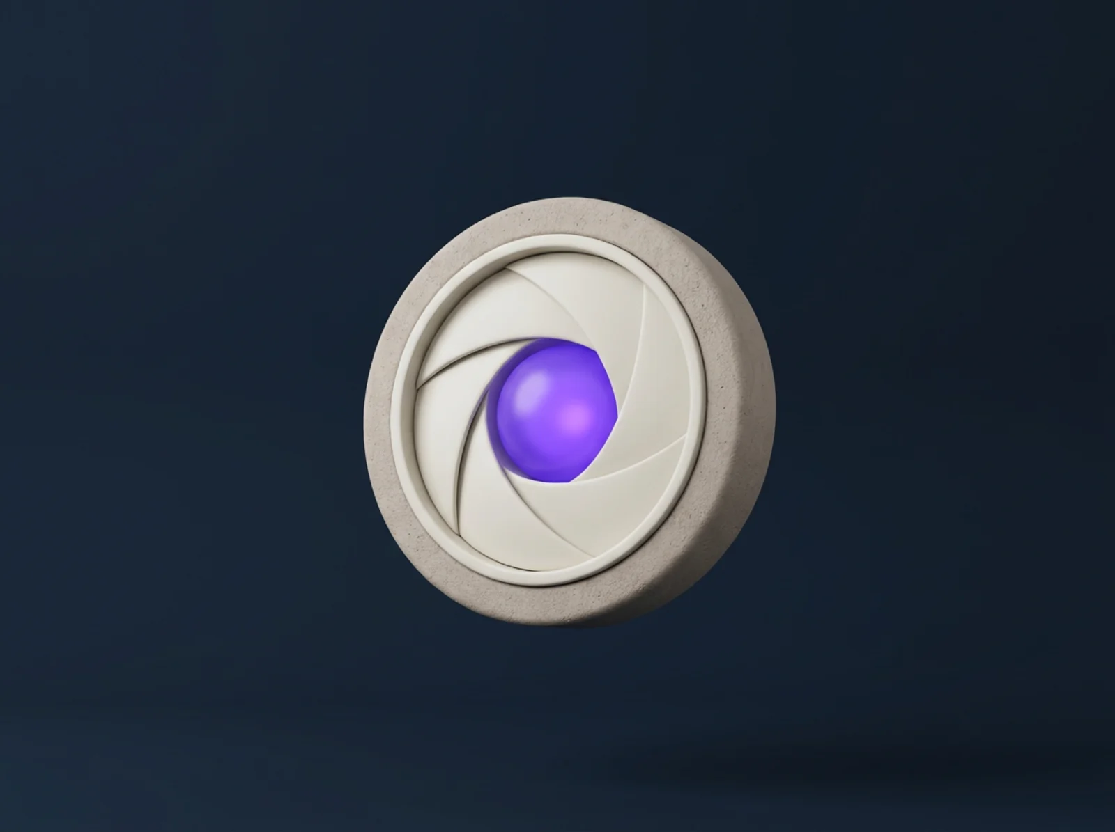
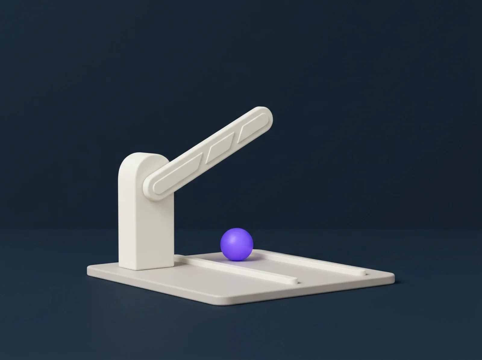
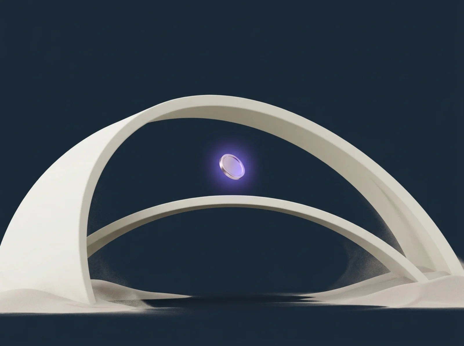
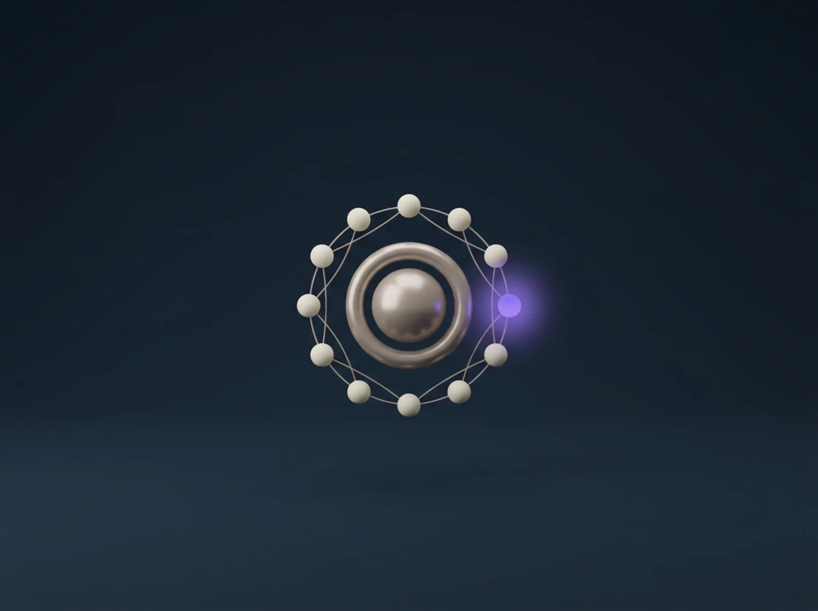
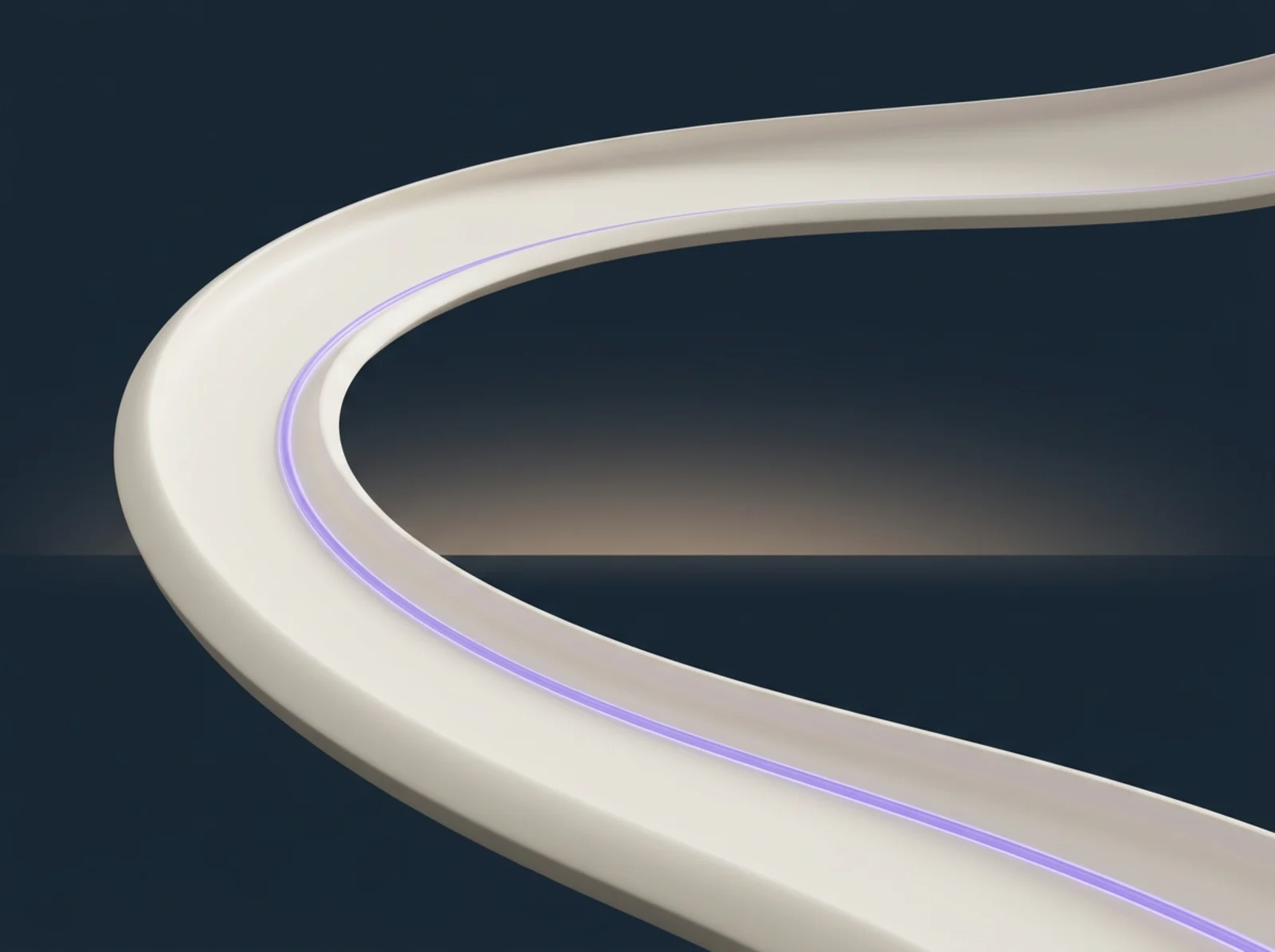
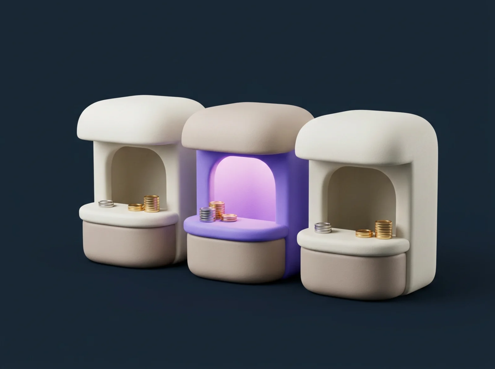
Ten abstract pieces, one per product idea, all on the same navy stage with the same cream-and-accent vocabulary so any two can sit on one page without arguing. Generated in-palette; the navy background makes them read correctly in both themes.


Verdict owls (experimental)
The soft owl retextured with allow, warn and deny eyes. The eye colours landed exactly; the body picked up a feathered speckle the flat vinyl set does not have, so these stay in the kit as expressive variants and are not wired into any surface yet. An honest kit records the misses too.








Usage
The rules for writing about A-Identity or placing the mark. The name is one word, hyphenated, with a capital A and a capital I: A-Identity.
Do
- Write the name as A-Identity, one word, hyphenated.
- Give the mark clear space on cream or ink backgrounds.
- Use the accent purple for the action, and only the action.
Do not
- Do not stretch the logo, or tint it yourself: recolouring is shipped, as the one-colour set above.
- Do not write it as Aidentity, A Identity, or AIdentity.
- Do not place the mark on a busy photo without a panel.
Need an asset that is not here? Reach us on the contact page.
Motion
The rule
Motion carries information or it does not ship. A request being checked moves; a decoration does not. Everything settles rather than hides under prefers-reduced-motion.
The values
Reveals: 0.6s, ease [0.16, 1, 0.3, 1], 24px rise, staggered 80ms. The live reference is the verify-then-pay flow on the landing.